Last October, one of my favourite clients whisked me off to a Cancer Australia Pink Ribbon Breakfast. This caused great excitement in my household. I rarely leave the kitchen table when it comes to work… let alone into the big city!
So why am I talking about an event that happened last year? I wrote about this just after the event, but I thought it was worthwhile talking about the concept of ‘risk’ as I keep mentioning it when talking about brain health.
Anyway, over breakfast we were entertained by some great speakers, and I noticed three really interesting things related to breast cancer:
1. If you are going to get breast cancer, Australia is a pretty good place to be.
About 14,600 Australian women will be diagnosed with invasive breast cancer in 2012. And one in eight Australian women will be diagnosed with breast cancer by the age of 85. But, the really great news is that 89 out of every 100 women diagnosed with invasive breast cancer survive five or more years beyond diagnosis. Australia pretty much trumps almost every other country in the world when it comes to survival. Hooray!
2. If you’re a breast cancer survivor, exercising for two or more hours per week reduces your chance of breast cancer recurring.
Helen Zorbas (CEO of Cancer Australia, and my very first boss here in Australia) summed it up by saying:
…The evidence suggests lifestyle factors such as moderate levels of physical activity can reduce the risk of recurrence of breast cancer by 24% and reduce the risk of death by more than one third compared with inactive women…
Exercise! It is that simple. Good for your brain. Good for your boobs! (Ahem…)
3. Cancer Australia have nailed it when they explain breast cancer statistics. They use graphics.
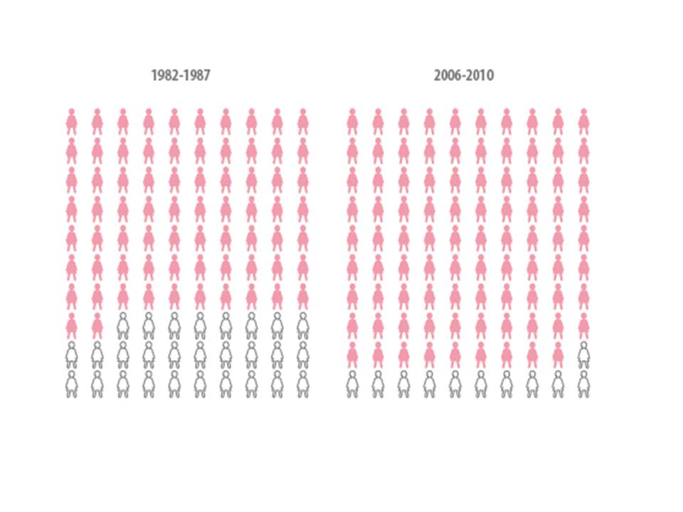
This image above illustrates the number of women (the pink ladies) who were still alive 5 years after receiving a diagnosis of advance breast cancer for the 1980s as against now. (The white ladies represent those who died.)
See how clear that is? It seems so straightforward because the numbers are presented in a way that mean something.
Another way would be to say this: “Since the 1980s, the absolute risk of dying of advanced breast cancer has dropped by 17%.”
Or another way would be this: “Since the 1980s, we have seen a 61% relative reduction in risk of dying of advanced breast cancer.”
See how confusing it can get!!?? Has the risk of dying dropped 17% or 61%? Even I’m struggling this figure this out!
The first statement is about absolute risk and calculates the risk reduction like this: 28 – 11 = 17.
The second statement describes relative risk and calculates risk like this: 17/28 = 61. Relative risk is always a higher number and is often what is quoted in the media as it is more attention grabbing.
I much prefer the graphic. And remember, we should always absolutely pay attention to absolute risk.
[hr]
Do you prefer words or graphics when it comes to explaining statistics? I’d love to know in the comments below!
[hr]
Share the love
[Sassy_Social_Share]
6 Comments
Leave a Comment
About Dr Sarah
Neuroscientist, Author, Speaker, Director of The Neuroscience Academy suite of professional training programs.
Latest Posts
Free 10 day micro-training in neuroscience

Learn one neuroscience concept a day!
10 simple, bite-sized lessons in brain health, delivered daily to your inbox


I definitely prefer pictures when it comes to talking about risk. I’m never quite sure what it means when people say something is “unlikely” or “rare” and the absolute and relative risks just confuse me.
Another way of describing risk is to compare it with everyday occurrences – risk of being struck by lightning, chance of winning lotto etc. It sounds good in theory but in practice I read that optimists tend to underestimate the risk of bad things and over-estimate their chance of winning. Plus people’s perceptions of risk is biased by recent or sensational events (what I call the Today Tonight phenomena) so may not be an accurate comparison.
So that’s why I love pictures. I’d love to get some textas and some wipeable wallpaper for my office wall with 1,000 people drawn on it; risk discussion solved!
Well congratulations on being my first ever blog commentor! You win a glass of pinot next time I see you 🙂
After living through 4 semesters of what seemed like never ending statistics, I would say I prefer to work out how the numbers are calculated and then calculate them. The picture above worked for me this time and when it’s in such a simple structure, however there are times when pictures confuse me more. Must say something about my brain. Hehe
This is why I make sure I continue go to the gym every week. Three and a half years post BC and counting!
Hi Carol
Awesome and inspiring 🙂
i like this article, thanks for sharing